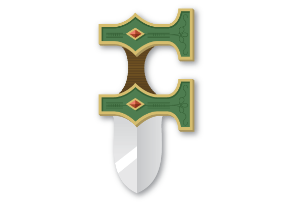
Robin Hood’s “F”
For a while now I have not made a drop cap. Well, I’m back to it today. Did you know that the letter F is kind of boring? There is not much you can do with it. Yes, you can make it cursive (which is pretty different than its normal version) and you can play with its serifs, but other than that, you can’t do much. So today’s challenge was to make a letter F that is unique and original.
What did I do to make the F more one-of-a-kind? You know what, I made another letter based off of a weapon. What is up with that? Trying to come up with reasons why I’ve made a couple of weapon-themed drop caps, I came up with a few possibilities: I’m trying to prove my masculinity, I deep down want to be the Spider-man super villian, Typeface (so stupid), original letters were based off of weapons, or I just fantasize about what it would be like to be in a medieval battle too much. No matter what the cause, I created my F to look sort of like a knife. Maybe even Robin Hood’s knife.
Now hopefully I just don’t make my G like a grenade or something…wait a minute…that could work. Hehe.

I think it’s about time to do a B. Maybe with a beach theme, including some palm trees. lol 🙂
I actually have made a B. Its not beach theme though, sorry. Hehe.
haha, I think you should do another B… but I like this F a lot… hehe, it’d be a cool sword/knife thing too, it’d be fast and you can dual wield them, and the handle can also work as punching knuckles. Im sure it would have an interesting balance for throwing too… hehe, see what you do? you bring out the nerd in me.