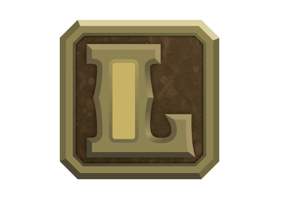
L is for Cool
L is a pretty cool letter. At least I think so. Yes, in a typographical sense, it kind of sucks. The capital variation is a little unbalanced and its large right space usually creates kerning issues. Then the lowercase little brother looks like a capital I in most sans serifs but the essence and personality of the letter L is still cool. Just think about the words that start with it: lion, little, love, Luke (super cool name), and library. I don’t know why but I just tend to like words that have L in them.
It’s actually kind of weird that I like the letter L so much because when I was younger and had a speech impediment, I rarely pronounced L’s correctly. I called ladder “laddel,” wolf “woaf,” and even pronounced my own name “chubby.” Luckily I can speak better now.
Either way, L is one of my favorite letters and here is the drop cap that celebrates it:
