Simplicity
Maybe one of the most powerful tools in a graphic designer’s arsenal is simplicity. I mean, isn’t that why we designers celebrate white space so much? White space forces us to simplify things and make the audience focus on the content. Designs that are complex and busy definitely have their place but sometimes, a design just needs simplicity.
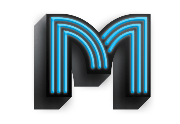
This is why I tried to make today’s M more simple than the rest of my drop caps. I gave it a simple drop shadow and blue neon tubes for texture, but other than that, I didn’t do too much. The best part is that it doesn’t need it.
