Resume Exploration
I am proud to say that I have recently left the world of job hunting to now enter the door of employment. It brings a good feeling but this transition has also made me look back at the process that got me here. I know I messed up a lot. I wish I networked more and worked harder to make an impression. I just never did it.
Nonetheless, I have a couple of friends who are about to start on the journey of making resumes and writing cover letters and they have inspired me to think about resumes again. They are truly beautiful projects if you think about them as a design problem. They are unique because you have to creatively display so much hierarchy and information.
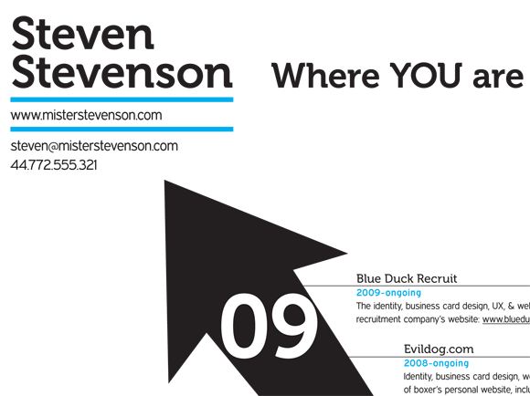
Well, after all of this thinking about resumes, I decided to make one. I took up the Steven Stevenson Challenge and made a resume for a fictitious web designer. I was approaching the project from a user interface perspective where I wanted potential employers to look at the resume and easily see a story. To do this I created a simple timeline showing education, experience, and freelance. Then to easily show Steve’s skills, I created a graph in the bottom left to show his strengths and weaknesses.
I like the concept behind the resume but I’m not sure about the execution. Looking back at the project, I wish I made the arrow out of Museo’s letter V and had more personality over all to the project. I also want the timeline and skills graph to interact with each other more and visually show the arrow pointing at the name. I was thinking of angling the title.
Either way, this would be a very different resume that doesn’t follow the trends that my teachers in school taught. It would however leave a lasting impression on your potential employer.

I like the fact that this resume isn’t boring. Glad to hear you finally got the job as well, you lazy bum (the one in LA, I’m assuming).
Oh yeah, my mom said to let her know when you get your tax refund or whatever. I expect you to be punctual, since you are now technically a professional.
don’t be so hard on yourself. i think this resume came out well and i love the time line arrow. i was wondering why you chose the colors you did for the software/languages key, but i’m assuming that’s the color associated with that particular program. i wish the colors were also used somewhere else in the resume. great job on the typography. i love the little triangles at the ends of the ruled lines. and that’s a weird phone number.
Well thanks for your kind words. I wish the colors were used else where too but couldn’t think of a good place at the time. The phone number is actually from Europe.
Nice brief and this mail helped me alot in my college assignement. Thanks you as your information.