Sexy
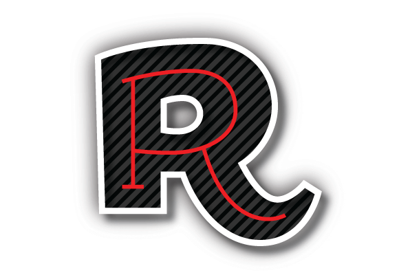
Really now, when you saw the title of this article, what were you thinking? Better yet, what were you hoping for? Hehe. Well, if you were hoping for some stereotypical, big-breasted anime chick, you guessed wrong. Today is a drop cap of my second favorite letter: R.
Why is it my second favorite letter, you ask? (We haven’t got to my favorite one yet). Well, “R” has so much character. It uses vertical lines (way better than horizontal if you ask me), diagonal lines, and curves. Its the only one of it’s kind; all other letters use only one or two line shapes. Plus, its shape derives from one of earth’s greatest beauties: the woman.
Most letters were based on things from the natural world. “M” probably came from mountains, “W” from water, “A” has been referred to as an upside down bull head, and “S” can easily be a snake. If you were an ancient society though, wouldn’t you not only make letters based off of animals and the landscape, but also yourself. That’s why scholars say that “I” may have been based off a man and “R” a woman. Can you see the side profile of the busty woman in the voluptuous shape of this divine letter. I remember an ex-design student/pastor turning heads when he talked about the letter with such lust to prove a point.
I may not be lustful myself to the letter “R”, but I definitely enjoy it for its personality and complexities. Its actually so complex, I just this morning discovered a secret about its form. Ever try and draw an “R” and find an imbalance to it? I always did. I always thought it was because of the curves, but its not! The secret to the “R” is possibly the most boring part of the letter: the top left corner.
Yes, the top left corner that links the vertical bar with the start of the curve is actually this special treasure that I can only compare to the holy grail in Indiana Jones and the Last Crusade. At the end of the movie, Indy and the Nazis find a room filled with grails. All of them are beautiful, filtered with gold, silver, and precious gems but one. The Nazi general finds out the hard way that none of them are the true holy grail. He drinks from it and lights on fire. Indy of course picks the simple wooden cup that heals his wounds. The top left corner of the “R” is like that: a subtle treasure lost behind the flourishes of curves and diagonals.
So what makes this corner such a treasure? Its that its not a right angle. It would make sense for it not to be but most “R”‘s corners actually extrude to the left, making that straight line a subtle diagonal. That small alteration holds up and balances the heavy right side of the “R”, especially the tail. Its something different but made a world of difference to me today.
Today’s drop cap is nice. I love the powerful colors and patterns, plus the extruding left corner, but my “R” today reminds me too much of old cartoon fonts from the eighties. Maybe its because the eighties was known to mock the Art Deco period where I am going to say my large curve derived from. Tell me what you think.
