Product Placement
So today I really wanted to use another free Veer product, because hey, it gives me a chance to use high quality material. I don’t usually get to use such high quality photography or typefaces at work.
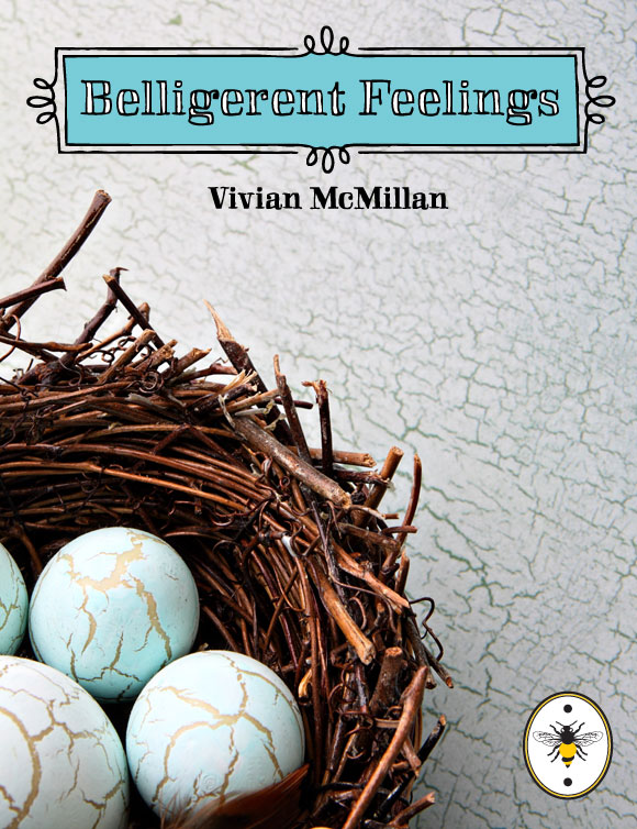
Instead of using their free typeface, Roos, I decided to instead use their egg photography. It was probably picked out because its Easter but nevertheless, its a nice photo.
I quickly decided to make a book cover out of it and tried to come up with ideas. I didn’t want it to be too literal of a title like “New Beginnings,” “Hatched,” “Forever Young,” or “First Steps.” I instead went with the opposite: a title that has nothing to do with the photo. Instead, it makes the reader go “what?” Its a simple tactic to make them want to read the book to find out what eggs have to do with “belligerent feelings.”
I was thinking the book was about an abusive relationship where the woman takes vengeance on her spouse by getting herself pregnant. Its a weird synopsis, but I like it.
Anyway, for the type, I used this beautiful hand-drawn typeface called Skitch that I found on the absolutely amazing MyFonts Newsletter.
I soon realized that all I did with this composition was slap some words on a pretty photo and called it done. The font and the photo weren’t even mine. I just felt that it was a good use of both the photo and typeface. That’s why this post is called “Product Placement.” This is really only a commercial for MyFonts and Veer. To these companies, you’re welcome.
