Fat
Kristina and I went to the LACMA today. We have been waiting to go for like 5 months. I’ve wanted to go since I moved to LA, but we decided to wait until Kristina’s favorite director would have his debut. So we waited almost half a year for Tim Burton to have his exhibition in LA, after first premiering in New York. It was of course amazing. There were monsters, aliens, dead babies, and clowns to name only a few.
The show actually got some negative reviews for being a little repetitive but I think that’s only because the critics aren’t huge Burton fans. The Edward Gorey like characters, patterns, and poetry are perfect for so many of us who were raised on Nightmare Before Christmas. And probably the best part was to see his transformation. He first started out drawing ugly sketches that you could see being his more contemporary works’ precursors. Then he went away from that style to be more Disney-like and more advertisable. We saw a lot of his signs and posters selling recycling and football. Then in college he learned how to properly draw in the classical manner only to drop it all for his dark and twisted abstractions.
Numbers

Either way, his monsters inspired me to draw some more. I was especially stimulated by his number series. He took numbers 1-10 and personified them into cute little monsters. 1 was a lonely fat guy. 2 was a tennis game between two creatures. 7 was seven hornets gettings attacked by a water monster. Each had so much personality.
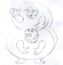
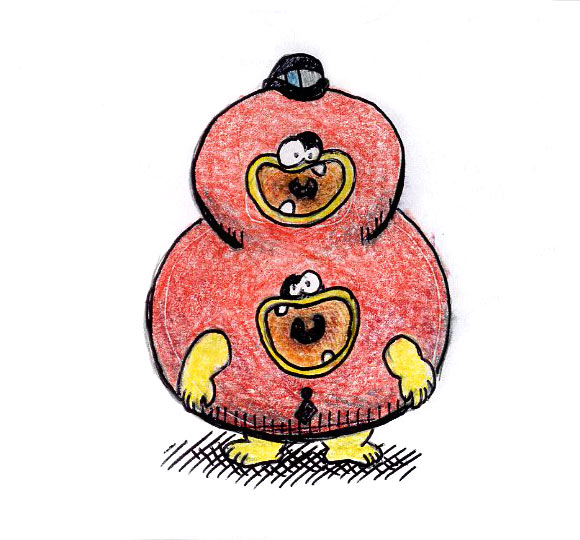
My problem with his work was number 8 wasn’t fat enough. When I think of the number 8, I think of fat. And I mean FAT. He’s also really dumb. He’s like Tweedle Dee and Tweedle Dumb. So I tried making my own number 8.
My first drawing was definitely inspired by the Japanese prints Kristina and I also saw at the LACMA. The Japanese liked creating line-heavy prints of demons and warriors at each other’s throats. These demons had harsh lines, a lot of hair, and impossible anatomical positions. What I thought was most identifying were the creatures feet. They seemed both fat and muscular at the same time.
I didn’t really like my first drawing because it seemed too much like I just made two fat guys in my normal style and inserted them into a number. They seemed too detached from each other. That’s why I made a cute monster that seemed like he really is the shape of an 8. I colored him red because 8’s are red in my head and made him a hungry hungry boy. What do you think?
