The Runaways

Have I ever told you that my roommate is in a band? Yeah, its pretty cool. I can actually tell people that. And the best part is that they’re not one of those bands that suck and won’t go anywhere but I still root them on because they’re my friend. They’re actually pretty good.
My roommate, Tony, is the keyboard player for this alternative rock meets soul band called Erna and the Erratics. They play an assortment of covers and cover blends to fill in the time gaps between their own songs. I love all their music though my favorite song may be their mix of Seven Nation Army and Sweet Dream. Actually, I may be their biggest fan. I’ve gone to more of their concerts than anyone else :).
Today I watched The Runaways with Kristen Stewart as Joan Jett. The all-girl rock band reminded me of Erna (though she’s not much like any of the characters in that movie) so I thought I would write about my experience working with the Erratics.
It all started when Tony told Erna I was a designer. Literally twenty minutes later she asked me to help with her web site. She had recently got a site with Bandzoogle, a band-specific, WordPress-wannabe CMS and needed some help customizing it.
Bandzoogle Review
I must first say, unless you want a very templated layout and little control over your site, don’t use Bandzoogle. Its user experience and admin controls are super simple but quite nice. They allow you to edit padding, font choices, margins, and background images of select objects on a fly. But if you want to add a third column or add containers around widgets (among other things), you’re out of luck.
Band Logo
Now going back to my story, Erna not only needed a revamped site, but also a logo to put on it, t-shirts, flyers, albums, etc. So before even touching Bandzoogle, I got some paper and a pencil out.
I wanted the logo to communicate Erna’s image:
- Almost always wears red, black and white
- Clothes are a mix of Rockabilly and Dream Girls
- Lives and plays in the Hollywood area
- Embues feminine strength, like Joan Jett and the Blackhearts
With these quick thoughts, I thought of old 1950’s Hollywood movies. They’re full of spirit and contain a certain retro feel that is somewhat common today. I also wanted to add a hint of female rocker to the equation.
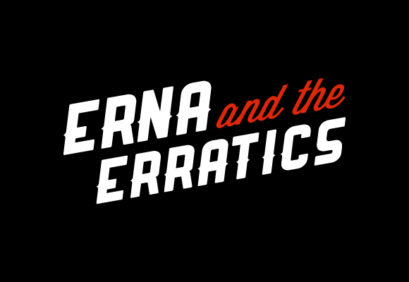
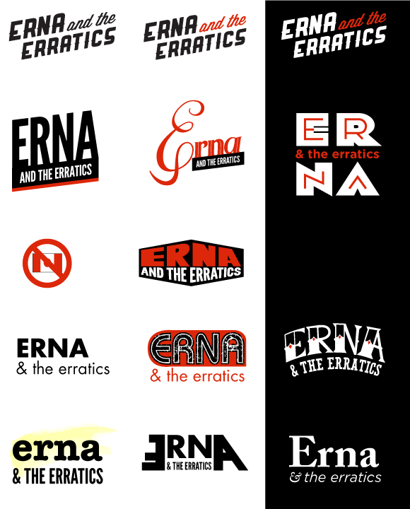
I went mainly typographic to save on time and to make the logo look like a old Hollywood movie sign. I used the typface Ranger for the main copy and Wisdom Scriptfor the ‘and the.’ I then sheared the text to make the copy more dynamic. Once that was done, the ‘E’ and the ‘R’ looked really similar. ‘Erna’ looked more like ‘Eena’ so I outlined the copy and tweaked the leg of the ‘R’ to be more defined. I came up withseveral designs, but I definitely like this one the most.
Band Web Site
Once the logo was made, I finally got the chance to work in Bandzoogle. Like I said earlier, the CMS doesn’t allow you that much control. All I wanted to do was add containers around the content blocks in the side rail but I couldn’t. I wanted the header image and navigation to expand outside the page element but the only way I was able to do that was add CSS to every page making the header position:absolute. I was quite proud when I figured out how to do that. It was also interesting that you are forced to make the navigation links into images. Granted they generate the images for you but if you want to add any CSS effects to the text, you can’t.
By the end, I thought I did the best I could with what I had. If you have any other thoughts on erna.me or the logo I made for them, please leave a comment. Thanks!
