Bettering the World One Paint Can At A Time
I remember reading a blog saying that the best way to design something new and memorable is to go through your life, notice the things that need improving, and then design a way to enhance them. Of course, when I read that, I couldn’t think of anything on the top of my head that needed improving. Doesn’t it always work out that way? Anyways, it took me painting my house’s shed to find something.
The Flaw in Design
A couple of months ago, my house collected another roommate, increasing our population to 6 guys. We only had room for 5 so we had to come up with a solution to increase the living space. My roommate, Andrew, came up with the idea of turning our fairly large backyard shed into an outdoor bungalow.
We first got a new, smaller shed built next to the old one. Then we gutted out the barely standing original, taking out nails poking through the walls, decaying boards, and a metropolis of spider webs. Once stripped down, the shed was reinforced, insulated, given windows, and totally remade. The team we hired did an amazing job. But after the contractors were finished with the two buildings, it was up to the roommates to paint everything.
Because Andrew owned everything and put up the money, he of course had say of color. I don’t think I would have picked the same gold/green combo he did; nevertheless, the room turned out great.
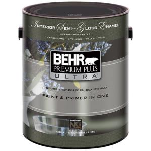
It took us about three days to finish painting. Because my roommates assumed that all designers “must love painting” and because of them were busy that weekend, I had to do a lot of the painting. It wasn’t bad but one of the things I noticed while painting was the paint cans. For one thing, they were really horribly designed. They used tons of different typefaces, many were too hard to read. They even use the horrible effect of using a different font for the first letter of each word. Ugh!

The worst part of the cans though was the fact that you had no idea what color was in a can until you opened it. We were using 4 colors that weekend: grey and white for the outside and green and gold for the inside. None of the cans matched those colors. Instead, the cans colors depended on whether it was matte or glossy, exterior or interior. It was horrible. As users, we don’t associate paint cans with the exterior one or the interior one. We say “I want the green can from the shed.”
The Solution
After that weekend, I decided I wanted to come up with a new idea for a paint can. My first thought was that they should just print the whole label the color of the paint. The problem though is that when you go to a store to buy paint, all the cans on the shelf are the same color: white. You have to get the Home Depot staff to mix in the CMYK to make your can Sunshine Vermilion. So the labeling has to be the same from can to can.
Well if the label can’t say the color, why don’t we have a smaller label? Then the label can cover a transparent can that shows the color inside. The can won’t be as durable, but does it really need to be? Who kicks around their cans of paint?
The Process
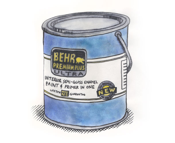
So today I made a simple pen/watercolor drawing of the new Behr’s paint can. The label would be a small belt-like sleeve that would cover the can’s belly while the tough plastic could reveal the blue paint inside. I thought a white label would look best among the spectrum of paint colors, except for white, which could have an inverted black label.
I really enjoyed drawing the packaging. Its been a while since I painted anything. I also found out that some pens are water soluble and will smear with the water from water colors. Good thing I have Photoshop, huh.

love it! With a transparent “can” you could also see how much paint you have left after you’ve used some and the lid goes back on. What did Behr say? Did you submit your idea to them?