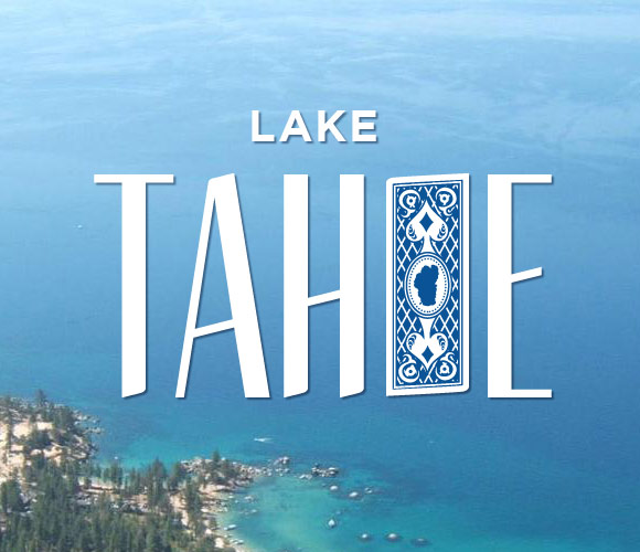
Lake Tahoe
Today I finally got down to making my new branding of Lake Tahoe. Ever since I saw Nicole Meyer’s web site, Branding 10,000 Lakes, I wanted to try and do the same to Tahoe.
Growing up in Carson City, NV, I would go to Tahoe a lot, especially in the summer. I would camp, hike, swim, jump off rocks, catch crawdads, run, sled, and snowshoe. I always agreed with the saying about Tahoe: its a glimpse of Heaven and a taste from Hell. I felt that way especially when running 20 miles of its winding trails going up and down its waving mountains.
It was a good time to do this project because I recently found out throughPinterest (my new favorite thing) that South Lake Tahoe created a new branding for itself: Tahoe South is where its at. You have to admit the typography of their new logo is beautiful. It has a nice ruggedness to it to show off the outdoor fun that can be had in Tahoe but it doesn’t have the gambling sophistication that the cities in Tahoe have. Its tough to show the indoor and outdoor excellence of Tahoe.
Today I created a brand to show off the beautiful blues of Tahoe, the gambling side of Tahoe, and the still keep the rough side of Tahoe. I combined a beautiful shot of Sand Harbor with Gotham Bold and Tommaso. I then replaced the “O” in Tahoe with a playing card I created. I think its intellectual, simple, and engaging.
