Iron Man


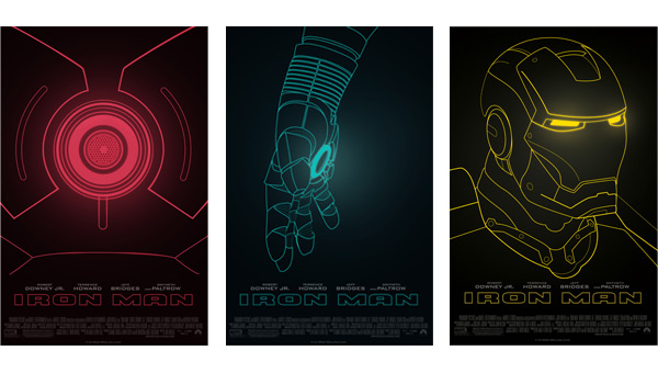
With this project, I worked with a group of designers to create a poster series for the 2008 Marvel Studios motion picture, Iron Man. The poster series was part of a design contest hosted by Paramount Pictures. The team, who also included Eric Hermann and Jen Liu, was assembled in my Cal Poly San Luis Obispo advertising class.
Define
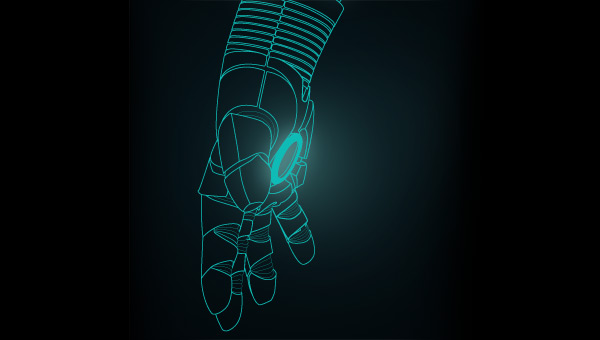
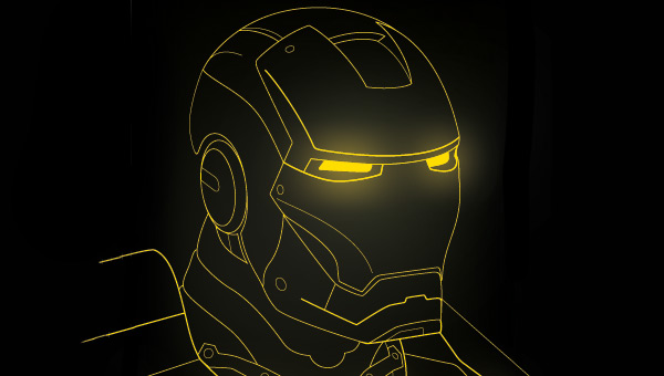
When we were coming up with the main concept of this movie poster series, we wanted to communicate enough information that any movie goer, including the non-nerd, would know what they were looking at while still being mysterious enough to build a curiousity. We decided on the technical drawings of the Iron Man suit’s helmet, chest and hand, that were influenced by the movie’s end credits, because we thought they were just the right balance. Plus, with the posters not only advertising the first Iron Man movie, but the whole franchise, we thought the technical drawing motif could symbolize the movie laying the ground work for the rest of the franchise.
Experiment
Early on we knew we wanted to go with the glowing technical drawing motif, but we weren’t sure which drawings to choose. There were several screenshots we looked at from the end credits but none of them looked good on a poster. We then created an entire suit of armor but it looked too flat, too comic book-y, and too stagant. It wasn’t until one night, Eric came up with the idea of focusing on the geometric forms of the chest piece did we find a solution.
Deliver
With a strong concept in our head, I quickly drew up the helmet and hand of the Iron Man suit. I then traced them in Adobe Illustrator and had them given the glow effect in Adobe Photoshop.