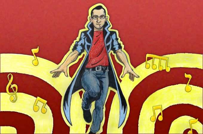
The Music Man

After drawing one of my roommates like a GI Joe super hero, my other roommate, Tony, got jealous. He wanted to be drawn as a super hero, too. I know what you are thinking, “They are not 10-year-olds, they’re 30!” My response to that reaction is, “Do adults really change?” Just listen to the Bowling for Soup song, High School Never Ends, to understand what I mean.
No matter his age, I didn’t want Tony to feel unloved. So, I decided one day to draw him as a music-based super hero because he’s a musician. It wasn’t until I bought my new iPad that I finally got the motivation to do so.
The New iPad
This past week, I bought a new iPad so that I could work outside my room. Lately, I’ been feeling like Rapunzel trapped in a tower and this iPad could be my prince charming. This week has been the test week to see how well my new prince could perform. I bought 2 apps that would help him perform these tasks:
- Photoshop Touch for illustrating and image manipulation
- Koder for code editing
After struggling initially finding how to connect Koder to an FTP account, it has been a wonderful text editor for me. Photoshop Touch, however, has not been so successful.
To test the illustration app, I decided on drawing my roommate’s super hero image with PS Touch and a simple stylus. I admit that I wasn’t in the best drawing mood but PS Touch’s interface still didn’t perform as well as I would have hoped.

Review of Photoshop Touch
The biggest problem would definitely have been the stylus and screen. I’m used to my Wacom tablet, which is pressure sensitive and can be touched by my palm. I want to look into a pressure sensitive pen this upcoming week but I hate how if I rest the side of my hand onto the iPad, I click on some other tool.
The next issue was the icons. I understand that Adobe is trying to have a clean and simple interface that hides as much as possible so that you can focus on the project at hand; however, I would constantly get confused of what would happen if I clicked on a particular button. For example, who’s idea was it to put the Crop, Warp, Text and Fill tools under the ampersand icon?
For an app that uses layers, why doesn’t it have layer styles. While building web sites, I’m continually using styles to add gradients, drop shadows, strokes and more. It would be a huge improvement to add this functionality.
Lastly my issue was the amount of steps to change the color, size, hardness and opacity of my brush. A common click pattern would be Brush > Brush > Size > Drag > Canvas. After a while I would get so annoyed whenever I would have to change my brush size. I’m not entirely sure how to make it faster, but it needs to be.
Conclusion
By the end of my drawing, I was surprised how well I did the likeness of Tony’s face but the rest of the drawing was a bit embarrassing. I ended up redrawing him with good old fashion colored pencils and paper.
I want to try again to use Photoshop Touch. Adobe has done a great job with the rest of the creative suite. They must know something about designing creative tools. In the mean time though, if you find another competitor that outshines PS Touch (I haven’t so far), please comment on it. One app that looks interesting is the vector-based Adobe Ideas.