Too Cheesy?

Xylophone and x-ray. Were there any other illustrations you saw hung above your elementary school white board? I can’t think of any. I was actually disappointed by that. Each year I would graduate to a new teacher and a new alphabet banner hanging in front of class. It started with really simple graphics of animals in Kindergarten and then developed to cute illustrations of less common animals and objects. By jr. high and high school, the only classes with the alphabet banners were foreign language classes with objects from that country.
I enjoyed the diversity of objects that symbolized the more commonly used letters like A, B, E, S, and T. I’ve seen alligators, anteaters, angels, apples, antelopes, airplanes, alibis and more for just the letter A. But X is the loser letter that sometimes is even defined by something that doesn’t even start with an X! Animalia by Graeme Base used a Fox with a saxophone.
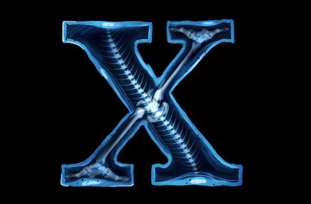
Oh well. The letter X may not have been blessed in elementary school with dynamic symbols, but at least it is a simple classic letter form. It’s sturdy yet dynamic. The letter X is one of the most balanced letters in the alphabet. It’s actually so versatile that it’s almost too easy to use. That’s why I had a hard time deciding what I wanted to do with this drop cap.
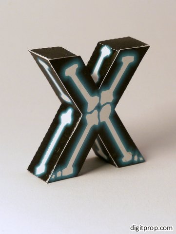
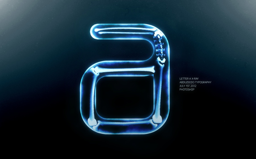
After some time though, I came up with the idea of turning the X-ray motif that the letter X gets all the time on its head. Instead of putting an X-ray of a human next to the letter, why not make the letter itself an X-ray! Sadly, when researching how to make an x-ray in photoshop, I found my idea wasn’t very original. 🙂
I was dissappointed when I found out my idea wasn’t very new. I feel like lately I’ve been consuming in the design community way more than I have been contributing in it. I even needed help making my drop cap today. I used one of psdTuts’s tutorials on how to make an x-ray of a banana.
I’m happy I’m growing and I’m happy that I think my X looks pretty sharp but I think this is a good sign for me to blog more often. 🙂


