Art Direction Stomps Design
You know the age-old favorite of Rock, Paper, Scissors? Its a great game that can be played for hours. You can even spice it up by making each hand something different. My favorite is Foot, Cockroach, Nuclear Bomb. You could even add variables like the Big Bang Theory‘s Rock, Paper, Scissors, Lizard, Spock. But I learned last week that there is a real game of Rock, Paper, Scissors in the design world. The game is Art Direction, Design! Well, I guess its not a perfect similarity. There are only two, instead of three and because there are only two there isn’t an endless cycle of one hand being able to beat yours. But still, if you are a designer, always know that art direction always takes precedence over design.
What Happened
So last week I was in charge of designing the cover of this year’s magazine for spcaLA. Because the organization has recently been sending needy Chihuahuas across the country to homes that want Chihuahuas, we wanted to make the cover about that. What did we come up with? We wanted a Chihuahua in a cardboard box airplane. Isn’t that adorable?! Well, if you don’t because you are from another planet or you’re an animal abuser, my bosses and I liked it.
So we did the photoshoot. Andy Sheng from Otis & Lucy did a great job, especially dealing with two tough models. One couldn’t stop trying to run off the stage and the other couldn’t stop peeing on everything! This was my first professional photo shoot so I was excited. None of the photos were just what I was envisioning but I doubt that actually happens often. Either way, I hope Andy will let us do this again because his work blew all of our other photography out the window. And working with his files are so much nicer! Man!
Anyway, when we came back to the office, we started sorting through all the photos he took. Obviously plenty went straight to the garbage. Either a dog was jumping out of the plane or he was more confused than happy. There were various reasons for it. There were also tons of really nice photos to choose from too. In selecting the photos, my two bosses and I ended up in two camps: I looked at photos with the best composition, lighting, angle, etc, while my bosses were looking for the cutest face (even if it made no sense in an airplane) and the biggest presence of our name (typical marketing department).
The Competition
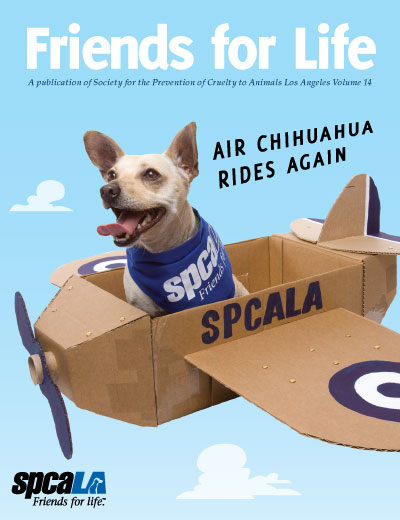
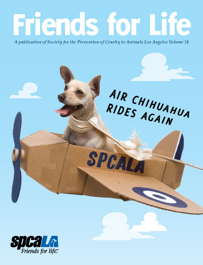
After a lot of work we narrowed it down to five photos, in which I made mock covers of. We then sent them out to key people in the organization and asked them what they thought. Of the five, I really thought #2 should have one but instead #3 did. #2 had a better composition. It was more active and in your face. #3 was flatter and stiff. What it had however, was a better costume and cuter face. Afterward, one of my bosses and I started talking about it. I expressed my feelings and she quickly gave me a quick bit of wisdom. For the majority of the world, a cute face will always stomp a good composition.

Cover #2
More dynamic and in-your-face shot. My choice.

Cover #3
Chihuahua with scarf and cuter smile. Selected choice.
Conclusion
A day or two before this little composition, I read an article about the difference between art direction and graphic design. The author described defined designers as those who make the “look” of a project while art directors make the “feel” of the project. It was a cool definition. I had originally thought that an art director was only the boss of a design firm. Anyway, I think this composition pushes the definitions even further. I think that the general public care more about the art direction of a project than its design, making that role more crucial.
The hidden trick that all the top companies use in their design that make them so successful isn’t proper typography or color or layout, though all of those things are important. Heck, I think they are still essential. But what makes them successful is art direction.
I like the “in your face head shot” photo as well! and a very interesting thought: designers > look, art directors > feel…. i like it!
p.s. is this a new “Submit Comment” button?
Thanks for noticing the new button look. Hope you like it. IE and older browser users won’t be able to appreciate it as much, but I look at it as an award for not littering the web with worse browsers.
My partner and I really enjoyed reading this blog post, I was just itching to know do you trade featured posts? I am always trying to find someone to make trades with and merely thought I would ask.