Happy Waitangi Day!
So I don’t know why I’m starting to make posts on random holidays but it may be because I can easily get inspiration from them. Holidays and traditions carry so many cultural symbols and values that a designer can draw from. That’s why artists and designers can create so many things for Christmas each year, many of which are completely original. Of course, when I say that, I don’t mean they create a replacement to Santa Clause or the Christmas tree. I mean that designers create new ways to show Santa Clause and the tree.
You can change the colors, patterns, styles. To promote a Christmas event, a designer can vary which symbols he uses. For one event, he can use a nutcracker while the next, Christmas lights. A designer has such a visual vocabulary for holidays that it is both the easiest and hardest job to do. The difficulty of designing for a holiday of course is using this vocabulary to make something original and new. Its a difficult task.
But then when you have a holiday that no one really celebrates, at least in my scope of the world, its easy to start building a vocabulary for the holiday. And its fun to celebrate a day that no one knows about. That’s why today I’m celebrating Waitangi Day: New Zealand’s Independence Day. Well, if you read Wikipedia’s article on Waitangi Day, its more of a Dependence Day because it commemorates the day New Zealand became part of the British empire. Wouldn’t most countries hate that day? Its like Waitangi Day celebrates the day that New Zealand lost and got invaded. Its of course not exactly like that but in the context of lets say the America Revolution, it is.
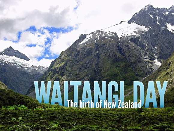
Either way, to celebrate New Zealand and its holiday, I created a simple typographic piece that emphasized not the type but the beautiful country of New Zealand.
I set the title in League Gothic for a couple of reasons: its simple and it is tall. The photograph, a beautiful and free landscape wallpaper on ManyWallpapers.com, was a reasonably tall photo and to have the type live in its space had to be tall as well. I then made the type snug into the mountains of New Zealand by masking some of the base. Finally I made the type blue to try and bring out the green of the vegetation. It looks so bright and colorful that you want to just lay in it.
For the subtitle, I originally wanted the letters to be frollicking around the rim of the foreground. Like they were dancing away from their big brother, “Waitangi Day.” My subtitle however was too long. The letters started to separate and not be words anymore. The photo also started to be secondary to the type which I wanted to avoid. So I just put the subtitle in front of the title, creating more depth, and called it good. Doing so made me have to play with kerning a lot too. Yay!
