How to Add Inner Shadow in Adobe Illustrator

For a long time my favorite design program has been Adobe Illustrator. I love the flexibility of vectors, especially when I’m working on print projects. Illustrator brings a freedom from ugly pixellation. Even working on web sites, my preferred application tends to be Illustrator, even when the industry standard for designing web sites is Adobe Photoshop.
If people ask why I don’t like Photoshop, I usually reference the article by Jason Santa Maria about what a web design application should be. He described his dream program and then compared it to all the major applications out there from Photoshop to Dreamweaver to even InDesign. He realized that Photoshop was actually the least similar to his fantasy program because it’s not easy to make global changes across pages and it’s only an approximate representation of what the final outcome will be.
But after working at Vantage Media, I have had to quickly change my habits. No one there uses Illustrator and if I want my co-workers to work off my files, I need to know Photoshop. It didn’t take too long to master it though because I had plenty of experience with the application before hand. But when I did get comfortable with Photoshop, my thoughts on web tools waivered.
Inner Shadow in Adobe Illustrator
Photoshop does have a couple of things that are better than Illustrator but the one that I can think of most is an inner shadow effect.
A common technique to add shape to call-to-action buttons is to add a 1px line at the top. It’s suppose to be a subtle highlight. You do this by adding a 1px inner shadow to your Photoshop layer. Illustrator sadly does not have this capability as of CS5.
Luckily I found a work around in CS4 and 5 using the Appearance panel. I have not seen this Illustrator technique done before so I thought I should share. So ladies and gents, today’s my first attempt at giving you a tutorial:
-
STEP #1: CREATE A RECTANGLE SHAPE
Use the rectangle tool to draw a simple shape. For this example, give the box a fill of light orange (#FFCC73) and a 2px inside stroke of dark orange (#C6560A).

-
STEP #2: ADD ROUNDED CORNERS
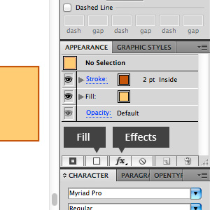
Making sure your rectangle is selected, look at your Appearancepanel. You should first just see the fill and stroke of your rectangle. In the bottom right corner of the panel, click on
fx > Stylize > Round Corners…In the dialog box, type 10px into the radius and click OK.

-
STEP #3: ADD NEW GRADIENT FILL
Next, we’re going to add a new fill to the rectangle by clicking on the Fillbutton in the bottom left corner of the Appearance panel.
If the new fill isn’t on top of the first fill, move it above by dragging. Then while the new fill is selected, give the rectangle a vertical orange gradient of #FFAA22 and #F47E20.

-
STEP #4: THE LAST AND SPECIAL STEP
Now if you did everything correctly, you shouldn’t see the bottom fill, which will soon become the highlight of the button. To reveal it, select the gradient fill and click on
fx > Distort & Transform > TransformShrink the fill vertically to 92% and move it down by 2px. These changes can obviously vary based on your desired button styling. Click OK when done.

Once you’ve added these styles to your box, your new inner shadow will resize with your button and stay vectorized. The real power of this technique is when you want to change the border radius. The highlight will change with the update unlike most Pathfinder enabled inner shadows.