Looking for Something New
For some reason I have been feeling like starting over recently. This past month has been a tough one for me: I got rear-ended, I got butt raped by the DMV, my rent went up, I got two parking tickets, and I wasn’t able to find any clients to work for. Times like this make you take a quick look at your life and try and find a way to repair and improve what is around you. Its like in the book I just finished, The Fifth Mountain, when their city was completely destroyed and all they could do was pick themselves up, dust them off, and start rebuilding. And the best part is that they didn’t just rebuild what they lost but they also improved and bettered their city. That’s the uplifting part of the human condition. We may fail a lot but failure only makes us stronger.
So, anyway, today was my one-year anniversary at spcaLA and it made me think about where I was at. I love in a sick apartment that’s way too expensive for my income. I have sort of a stale web site. Well, its good for a print designer that is afraid of the web but I don’t want to be that. My web site also doesn’t bring in any work, though they rarely do unless you add more to it. And I really have no mission for the design world. I have nothing that sets me apart from the rest that makes me more desirable than another designer.
That’s why I started to create a new brand for myself today. My brand, same with my web site, are extremely safe. There’s not much to them. They’re good, but not great. They also use the colors of the Green Lantern: colors that don’t really portray my personality.
I already started redoing my web site, making it HTML5 semantic. Why not completely transform it and make it truly one of a kind. Why not make it a site that makes users actually interested in me enough to see how I can serve them. And not only that, but also make a redesign that shows that I can make a profitable redesign, which is really what all customers want.
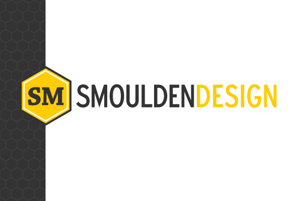
So I created a new mark that still has elements from my current one.
Similarities
- I still use Expressway.
- I still use the lack of a space
- I still use the separation of words through color.
- I kept the initials as a mark
Differences
- I added Chaparral Pro to the initial mark. This would also bring about adding it to the body of my content. Chaparral would create more visual interest to my design and add sense of diversity. Chaparral already is a beautiful slab/roman mutant. Using it with Expressway would add a nice spectrum.
- I went by “smoulden design” rather than “shelby moulden.” My url is “smouldendesign.com.” Shouldn’t the web site then be “smoulden design?”
- I added the hexagon. I added this for two reasons: it links to the “bee” in “Shelby” and it hints towards the hard-working, no frills methodology of Peter Behrens and the AEG trademark.
- I changed the green to yellow. Yellow is meant to be faster, cheerier, and more optimistic, besides being my favorite color. The goldenrod yellow again brings back the bee metaphor of hard-working, determined, and skilled.
- I also changed the black to a dark charcoal and inverted my primarily black web site to white. This was meant to lighten my identity because I want to be more friendly and engaging, rather than serious and drudgeful.
As you can tell, I haven’t updated by brand or web site yet. I even started making sketches for a new interface but until then, I would love your input. Tell me, is this brand too similar to the current? Is it too bee-ie? Should I change my url before changing my brand name? Is contrast strong enough between the yellow and white? Any praise and criticisms would be appreciative.

PS—If you haven’t already, you should check out the nice touches Jessica Hische made to her web site. She did a phenomenal job updating the site, making the interface bigger for larger screens, her url’s hysterical, and the controls less finicky.