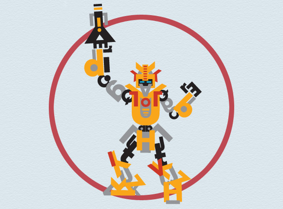
Rock ’em Sock ’em
I don’t remember where I heard about it but I recently found a super stellar website called font-bot.com. Typographers, or anyone really, are meant to illustrate robots with nothing but letters (A-Z) and then submit their beasts to the site so they can compete by vote. Picture Rock ’em Sock ’em Robots, Medabots, or the new Real Steel movie for type nerds.
I thought it was a great idea so I decided to design a bot. I based my robot on Gundam Wing and Transformers because I think they are the coolest robots. I then picked Futura Std for my font because I thought it was futuristic and machinal enough to be robot parts while being simple enough to look like letters and not abstract shapes like some of the robots that competed looked like (Dark Crystal Script makes for a stellar robot but it seems almost cheating).
To make my robot, I first made a quick blob tool sketch of my machine in Illustrator. I used a 10% grey and saved the drawing on a locked layer. Then on a new layer, I wrote all of the letters in the alphabet (both upper and lower case). I tried moving the letters around while they were still type but soon found that selecting them became difficult when there was a lot of letters next to each other. That’s why I outlined all the letters. I slowly would move letters into place, experimenting how well they would fit as an arm or leg, rotating or reflecting the letters as need be.
Through this project I learned a lot about Futura. I found that the uppercase “E” and lowercase “r” were great as hands. Uppercase “I” and lowercase “l” were great fillers where I needed them. Uppercase “L” was a great letter for right corners while uppercase “J” was great for smaller rounder corners. I also learned that “b,” “d,” “p,” and “q” are all the same letter except reflected and rotated. I learned how similar the “g” and “a” are. I felt like I was in Typography 101 all over again. After finishing the structure of my bot, I added color to him. Of course I chose yellow but I added highlights of red and grey to foreshadow the premiere of my new redesign.
While working on the project, I actually thought this would be a great project to learn about type in college. Students can be creative with their robots and still learn how letters are shaped. Then if they made multiple machines using very different typefaces, they could see how different letters like “a,” “g,” “M,” “Q,” or “W” are depending on the typeface.
Well, I turned in my robot this morning and it was excepted for competition. Once he finds a competitor, he’ll be up online wanting your vote. So please, vote my font-bot!

I designed a bot as well (Miss Murder) but yous is one of my favorites to date! Well done!
…Awesome website…
[…]The total glance of your site is great, let smartly as the content![…]…
…Websites you should visit…
[…]Wow, incredible blog format! How long have you been blogging for?[…]…