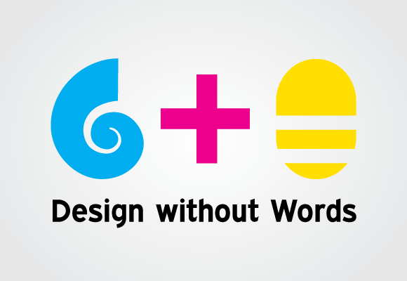
Shell Plus Bee
First off, Happy Nevada Day everyone! Yeah, I know, its Halloween today too but few celebrate the wondrous birth of the Silver State. So! While most are running around in costumes looking for candy and alcohol for tonight, I will be saying thank you to dead Abraham Lincoln for giving birth this country’s 36th state (it was a tough pregnancy you know). Hehe.
Actual Post
Today’s post is on a logo I made for myself if I ever wanted to redesign my identity system. That will probably happen at sometime because it seems that all designers want to redesign their stuff every two years or so. I’m even more inclined because by current logo is just my name. I still think my logo is fine. I use powerful colors and the beautiful Expressway to create my name in a very simple yet elegant fashion. It symbolizes me quite a bit.
Icons
The only thing is that though simplicity defines me greatly, so does complexity and illustration. Remember, I originally wanted to draw comic books for a living. I even more love icons. I think almost everything should be defined by a symbol. By doing so, we wouldn’t have to read so much to get a particular message across. I am not saying to get rid of words. Remember I love typography. But I think well though out icons speed up comprehension to velocities words can never do. This speed of comprehension is why I love and hate the new logo I created.
New Logo
When I was working at the front desk of my college dorm, all the front desk workers had a card with our name on it so people knew who we were. For a conversation starter, I wrote my name as a pictogram of a shell and a bee. It was a huge success. I got to know a bunch of people with that title. Some people loved the creativity while others just enjoyed the little game I gave them. Some people actually thought my name was “Clam wasp” for a while. Ever sense than, I enjoyed that my name could be turned into pictures. Few can.
Yesterday I thought about making a logo out of the idea. I knew I wanted to actually make it but I started to wonder if I should actually use it or not. Here are my pros and cons to it:
Pros
- Memorable
- Shows my love of icons & illustrations
- Colors can symbolize CMYK process colors
- Shell symbolizes a new home, strength, safety
- Bee symbolizes speed, utilitarianism, productivity
Cons
- Over simplified illustrations doesn’t show my love of typography
- Could be confusing…Clam wasp?
- CMYK hides my web RGB background
- Water, honey, and stingers are people’s first thoughts
There are definitely some nice ideas behind the new logo but I don’t think they are enough for me to use it. Besides, I am currently too busy to redo my entire identity system. Have any other affirmations or critiques on the fantasy look. I would love to hear it.

1. I love the CMKY, but I agree with you… You’re an RGB guy too (and maybe even before CYMK)
2. I saw a shell for the blue shape, but I first saw a computer mouse for the bee. I also saw the letters “GTO” spelled out. Too bad those weren’t your initials
3. I would have to disagree that this is faster than just reading your name. This is way more thought provoking and fun, but you definitely have to stop and think about it (But I mean once you become the greatest graphic designer in the world, you can have any logo you want and everyone will recognize it!)
4. I like the symbolism
5. Would “Design without Words” be your slogan? That can be quite limiting for design, but I can’t complain. I don’t like reading.
6. I could totally see this being used really cool on a business card.
Overall, well done. Good job on the swirly shell – swirlies are difficult to make!! And Expressway fits very well.
When making the logo, I kept on trying to come up with other ways to symbolize the bee (it does sort of look like a computer mouse). All I could think of was a set of wings. Wings wouldn’t work though because that would make the bee too complex compared to the other shapes and may need another color, which I really don’t want to do. I realized though antennae may be the answer!